Facebook UI System
Facebook — CreativeXDesign Studio: Studio Dumbar
MAKING FACEBOOK BRAND DESIGN SYSTEM MORE CONNECTED TO THE PRODUCT
︎ Improving the way Facebook is depicted in our marketing has been one of the biggest areas of opportunity for our Brand Design System. We set out to design a system that would enable us to tell stories that stay grounded in Facebook’s most iconic features while offering the flexibility to meet our ever-evolving creative needs. The result is a significant update that makes it more rooted in the product than ever before.
01. PRINCIPLES
The UI System is built on a foundation of three core principles.
These should be evident in every piece of work that represents the brand.
The UI System is built on a foundation of three core principles.
These should be evident in every piece of work that represents the brand.

STAY TRUE TO THE SPIRIT OF THE PRODUCT
We must always capture how it feels to use Facebook without misrepresenting the experience.

USE THE PRODUCT AS STORYTELLING TOOL
Our system is built to tell the stories of people and communities in a clear and direct way.
BRAND IS PRODUCT AND PRODUCT IS BRAND
To the three billion people who use Facebook, our product is how they experience our brand. So, we honor that relationship in all our communications.
02. SIMPLIFICATION BY SUBTRACTION
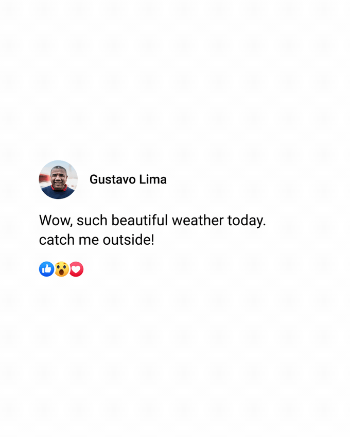
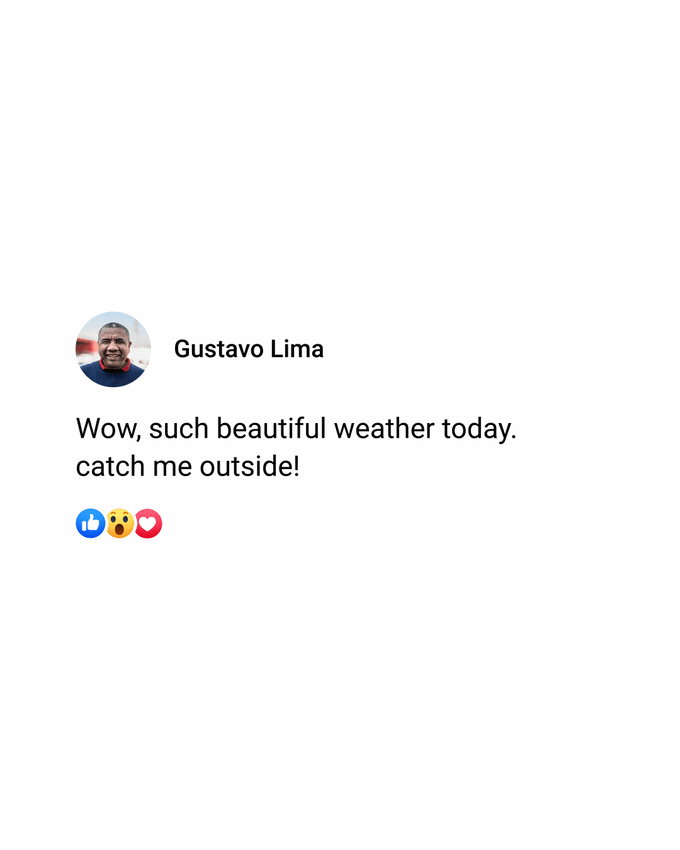
Our system prioritizes mobile aspect ratios and a streamlined visual approach that stays true to the spirit of the product. We simplify the UI to distill Components to their most iconic forms while prioritizing brand linkage and ensuring our audiences always follow the story.
Our system prioritizes mobile aspect ratios and a streamlined visual approach that stays true to the spirit of the product. We simplify the UI to distill Components to their most iconic forms while prioritizing brand linkage and ensuring our audiences always follow the story.

ADJUSTMENTS
a. The profile photo and user's name are more prominent.
b. Reactions are given priority, and the UFI tray has been removed.
c. Additional white space gives content room to breathe and boosts text legibility.
d. UI is always depicted over white instead of Paperwhite to maintain fidelity to the product.
03. FLEXIBILITY
Our system allows you to choose between two different sets of templates for maximum flexibility: Full-screen and Stickers.
Our system allows you to choose between two different sets of templates for maximum flexibility: Full-screen and Stickers.

FULL-SCREEN
We use Full-screen UI to tell stories through the product
We use Full-screen UI to tell stories through the product

STICKERS
We present UI in the form of Stickers placed on top of footage to tell stories in a rapid and simple way.
We present UI in the form of Stickers placed on top of footage to tell stories in a rapid and simple way.
04. BALANCE
We carefully consider every narrative to maintain a consistent look and feel across the brand. And we make sure we never overwhelm our audience.
We carefully consider every narrative to maintain a consistent look and feel across the brand. And we make sure we never overwhelm our audience.

MAKE IT FEEL FAMILIAR
We tell stories as people would experience them in Facebook.
We tell stories as people would experience them in Facebook.

MAKE IT EXPRESSIVE YET SIMPLE
Our simplified approach to visual design means the UI System can flex across a range of human emotions without overwhelming the audience.
Our simplified approach to visual design means the UI System can flex across a range of human emotions without overwhelming the audience.

MAKE STORIES IMMERSIVE
Our narratives are directly inspired by our energetic, vibrant community. We should reinforce the spirit of our community in every story we tell.

USE MOTION TO CREATE BALANCE AND RHYTHM
By staying true to Facebook product behaviors, our UI can show up in a way that feels expressive and human.
05. TRANSITIONS
Transitions between UI Components are based exclusively on Facebook's Motion Design System. They are designed to mimic the experience of using the app and authentically reflect user behavior.

SCROLL ︎︎︎

PINCH AND ZOOM ︎︎

SWIPE ︎︎︎
06. TYPING
As it’s such an expressive way to convey the mood of the main character, Typing plays a central role in telling the story in any UI ad. We use it thoughtfully, bearing in mind that long periods of typing can bore the audience. In the UI system, there are four ways to display Typing.
As it’s such an expressive way to convey the mood of the main character, Typing plays a central role in telling the story in any UI ad. We use it thoughtfully, bearing in mind that long periods of typing can bore the audience. In the UI system, there are four ways to display Typing.


06. HIGHLIGHTING
When we want to highlight a specific element of an ad, we isolate and enlarge that element. We use this technique sparingly to retain its impact.
HIGHLIGHTING WORDS
HIGHLIGHTING SENTENCES

HIGHLIGHTING TYPING